Understanding User Psychology: Key to Effective WordPress Design
In the realm of WordPress design, understanding user psychology is paramount. By tapping into the cognitive and emotional responses of users, designers can craft websites that are not only visually appealing but also highly functional and engaging. This blog post explores how psychological principles like color psychology, perception theories, cognitive load, typography and navigational structures can significantly enhance user experience and drive engagement on WordPress sites.
The Role of Color Psychology in User Engagement
Colors are not merely aesthetic choices; they evoke emotional responses and can significantly influence the perception and behavior of website users. Understanding color psychology helps designers select palettes that align with the brand message and user expectations, thereby enhancing user engagement. For instance, blue often instills a sense of trust and security, making it popular amongst banking and finance websites. On the other hand, red can trigger excitement and urgency, ideal for call-to-action buttons or promotional banners.
Applying Principles of Perception to Layout Design
The Gestalt principles of perception—such as similarity, proximity, continuity and closure—can guide WordPress designers in creating layouts that users intuitively understand and navigate. By arranging elements on a page according to these principles, designers can lead the user’s eye in a logical flow, making information consumption smoother and more natural. For example, grouping similar elements together (similarity) or creating patterns that the eye follows (continuity) can greatly enhance the readability and attractiveness of a webpage.
Utilizing Cognitive Load Theory to Enhance User Experience
Cognitive load refers to the amount of mental processing power required to use a site. Effective WordPress design minimizes unnecessary cognitive load by providing a clear hierarchy, intuitive navigation and familiar icons and layouts. This consideration is crucial because a site that is easy to understand and interact with keeps users engaged longer and reduces bounce rates. Simplifying processes such as form filling or navigation, by using well-known icons or reducing the number of options, helps users complete tasks efficiently without feeling overwhelmed.

Leveraging Color Psychology to Enhance User Experience
The Influence of Color on Emotion and Behavior
Colors are not just visual elements but psychological triggers that influence user emotions and behaviors. In the context of WordPress site design, choosing the right color palette can invoke specific feelings and actions from users. For example, blue often instills a sense of trust and reliability, making it popular among financial and healthcare websites. Red, known for its ability to evoke urgency and excitement, is frequently used for call-to-action buttons or special promotions. Understanding these emotional cues allows designers and marketers to strategically deploy color schemes that enhance user engagement and drive conversion rates.
Optimizing Conversion Rates Through Color Strategy
Conversion rate optimization (CRO) is a critical goal for any commercial website. Colors play a pivotal role in this aspect by affecting the visibility and attractiveness of key conversion elements like buttons, banners and navigation links. A/B testing different shades can reveal which hues encourage more clicks and conversions. For instance, contrasting colors can make important buttons stand out, whereas complementary colors can guide users smoothly from one section to another, creating an intuitive flow. By meticulously analyzing how colors impact user behavior, designers can create more effective WordPress sites tailored to specific marketing goals.
Choosing the Right Palette for Target Audiences
The demographic and cultural background of a website’s target audience should influence color choices. Younger audiences might resonate better with bold, vibrant colors, while older users may prefer more subdued tones. Cultural significance of certain colors varies greatly—a color that’s considered lucky or prosperous in one culture might not hold the same connotation in another. This cultural and demographic consideration ensures that the color scheme not only meets aesthetic standards but also resonates well emotionally with its intended users. By aligning the color psychology with user demographics, WordPress designers can craft sites that speak directly to the hearts and minds of their visitors.

The Role of Typography in Emotional Engagement
Typography and Emotional Perception
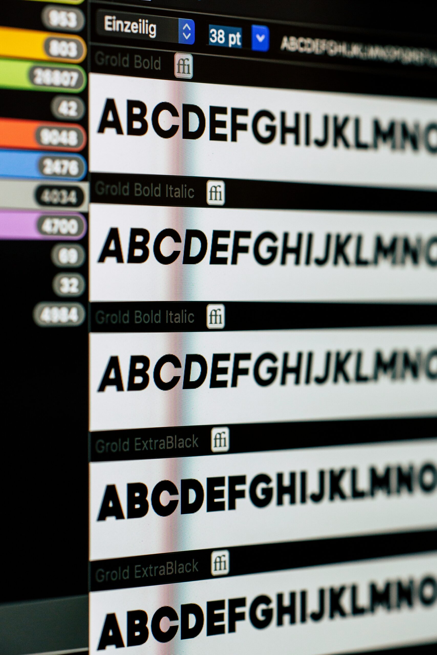
The choice of typeface in web design can dramatically affect how users emotionally engage with the content. Each font carries its own psychological weight and connotations. For instance, serif fonts often evoke a sense of reliability and tradition, making them ideal for institutions like banks or legal firms aiming to project trustworthiness. Conversely, sans-serif fonts, with their clean and modern appearance, are frequently used by tech companies to convey innovation and efficiency. By carefully selecting typography that aligns with the brand personality, designers can influence the viewer’s emotional response, enhancing connection and trust.
Enhancing User Experience through Typeface Selection
Effective typography does more than embody brand personality; it also significantly enhances user experience and readability. When text is both visually appealing and easy to digest, users are more likely to stay engaged. To achieve this, designers must consider factors such as font size, line spacing and color contrast. These elements work together to create a harmonious reading environment that reduces eye strain and cognitive load. By fostering a more comfortable reading experience, visitors are encouraged to spend more time on the site, thereby increasing chances for conversion.
Typography’s Influence on Emotional Conversions
Understanding the emotional impact of typography isn’t just about aesthetics—it’s also a powerful tool in optimizing conversion rates. The emotional context set by a typeface can subtly guide users toward taking action, whether it’s signing up for a newsletter, making a purchase, or another specific call-to-action. For example, a playful, handwritten font might be more effective on a children’s website, encouraging interaction and excitement, while a bold, commanding font can be more persuasive on a landing page for a high-stakes product, driving users towards conversion through its implicit authority.

Navigational Structures: Influencing User Decisions and Flow
Navigational structures on a WordPress site are not merely functional elements; they play a crucial psychological role in guiding user behaviors and decisions. By understanding these psychological underpinnings, designers and marketers can craft websites that not only draw users in but also lead them towards desired actions, such as purchases or sign-ups.
The Role of Cognitive Load in Navigation Design
Cognitive load theory suggests that when information is presented in a manner that overloads an individual’s cognitive capacity, comprehension and decision-making can suffer. In the context of website navigation, this means that overly complex or unintuitive menu structures can hinder user experience and reduce efficiency. Simplifying navigation menus and categorizing items effectively reduces cognitive load, making it easier for users to process information and make decisions. This approach not only enhances the usability of a site but also subtly guides users towards making choices that align with predefined marketing goals.
Using Color Psychology to Influence User Flow
Colors convey emotions and can significantly impact user perceptions and interactions. In web design, color can be used strategically within navigational elements to influence user flow and highlight calls to action. For example, a vibrant color for a ‘Sign Up’ button against a neutral background can draw attention and prompt action. Additionally, consistency in color usage establishes visual harmony and aids in intuitive navigation, aligning with psychological principles that favor familiarity and ease.
Architecting Hierarchical Structures for Decision Making
The arrangement of information plays a pivotal role in how users interact with content. Hierarchical structuring of information enables designers to prioritize content and guide users through a logical flow, from general information to more detailed content. This not only improves the discoverability of information but also leverages the serial-position effect, where users tend to recall the first and last items in a series most prominently. By placing key actions or links in these positions, websites can increase the likelihood of user engagement and conversion, effectively using structure to psychologically nudge users towards desired behaviors.
Harnessing Psychology for Superior WordPress Design
Incorporating psychological principles into WordPress design is not just an innovative approach but a necessary one for creating user-centric websites. By understanding and leveraging elements such as color psychology, cognitive load theory and effective typography, designers can create intuitive, engaging and conversion-friendly websites. As user behavior continues to evolve, staying attuned to these psychological insights will ensure that your WordPress site remains effective and relevant.
Frequently Asked Questions About Exporting Orders from WooCommerce
Understanding the psychological aspects of web design can significantly enhance user engagement and experience. Here are some frequently asked questions to help you grasp how to apply these principles to your WordPress site.
What is the role of color psychology in web design?
Color psychology involves understanding how colors affect user emotions and behaviors. For instance, blue can create a sense of trust and calm, making it ideal for financial or healthcare sites, while red can incite urgency and excitement, perfect for call-to-action buttons.
How do Gestalt principles improve website layouts?
Gestalt principles like similarity, proximity, and continuity help designers create visually cohesive and intuitive layouts. By grouping related elements and ensuring a logical flow, these principles enhance user navigation and information processing.
What is cognitive load and why is it important in web design?
Cognitive load refers to the mental effort required to process information. Reducing cognitive load through simple navigation, clear hierarchies, and familiar icons ensures users can interact with the site effortlessly, improving user retention and satisfaction.
How does typography influence user experience?
Typography affects readability and emotional perception. Serif fonts can convey reliability, while sans-serif fonts can evoke modernity and simplicity. Choosing the right typeface, size and spacing improves readability and user engagement.
How can navigation structures impact user decisions?
Well-structured navigation simplifies user journeys and decision-making processes. Using clear, intuitive menus and highlighting key actions with strategic color use can guide users toward desired actions, such as making a purchase or signing up.
Ready to Transform Your WordPress Design?
Are you prepared to elevate your WordPress site by incorporating these psychological principles? Our expert team is here to help you create a user-centric, engaging, and high-converting website. Contact us today to start your journey towards a more effective web presence. Let’s design with purpose and psychology in mind!

